Erro Wines
Visual Identity + Packaging
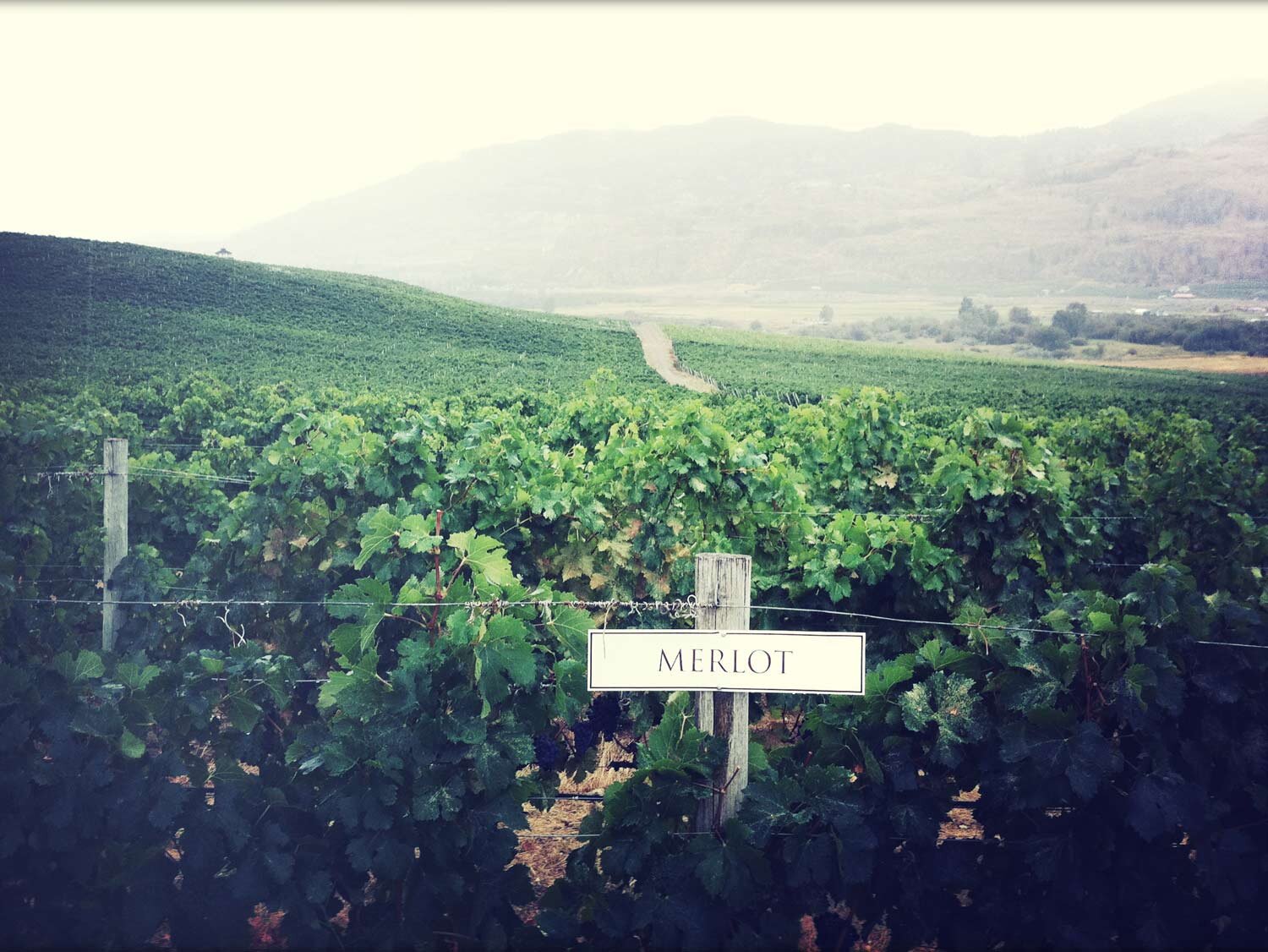
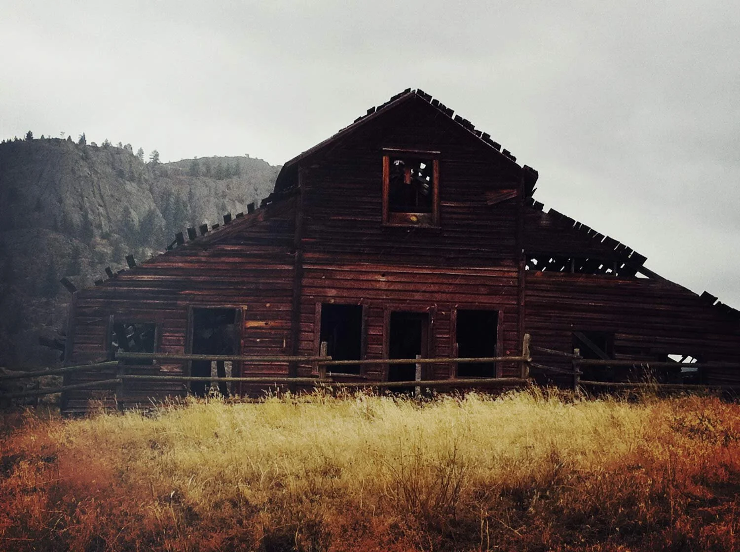
The brand's namesake Erro (concept: to wander, stray or be mistaken) is visually communicated with a vintage Polaroid photo - depicting the concept of two vagabonds roaming the land. We journeyed through the southern interior of BC capturing images to be used at first release, and to swap out for future releases. The photography was achieved with an iPhone 4 camera.
The first Erro Heavy Handed Red Blend was released in 2011 with a series of 3 images in rotation at top restaurants throughout Vancouver and Whistler.